By nature, people are visual creatures and we’re naturally attracted to images, especially those containing people. Marketers have found out long ago that using striking imagery accompanied with smart copy can affect people and their behaviour towards products and brands.
Statistics are also showing that social networks that were growing the most in last couple of years are purely image based. As a matter of fact, according to Social Times, Pinterest and Tumblr were the fastest-growing social networks in 2014.
Exponential growth of mobile devices with cameras empowered people to create more visual content and share it in seconds on their social profiles or via text or email. In this article I will identify the most common visual content mistakes and show you how to leverage this influential content marketing to achieve your business goals.
What is visual content and why is it the future of the content?
What is visual content you may ask in the first place and what is its difference from other forms of content. Let’s define it first.
Visual content is mostly used in marketing and gathers different forms of content marketing based on visual elements.
Visual content marketing encompasses the use of:
- Images (Instagram, Pinterest, Tumblr)
- Infographics (Infogram, Visually)
- Slides (SlideShare, Speaker Deck)
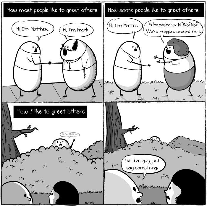
- Comics (The Oatmeal)
- Videos (YouTube, Vimeo)
- Memes (9gag, Clients from Hell)
- Visual note taking hand drawn videos (TED-Ed)
Popular social media channels like Snapchat, YouTube, Facebook, Twitter, Instagram, Pinterest, Tumblr, and Vine are great examples of distribution channels in visual content marketing strategies.
What makes visual content so important and demanded? Why is it a “thing” in 2015?
In the case of reading, our brain decodes visual information 60,000X faster than text. Visuals are perceived faster and can evoke much stronger emotions when the receiver sees the content.
- Information overload. There is more information created in one year than it was created in thousand of years prior now. We’re drowning into the ocean of text based content.
- Life pace is increasing and rapid lifestyle is shaping our future as well as the way we read, learn, and enjoy. People don’t have time to read and skimming as well as scanning have become the norm in many industries.
- Virality, and easy share-ability. Think of the exponential growth of Pinterest and Tumblr, which are purely visual based. Images are easily shared and received much better than plain text.
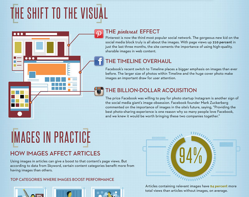
To back up these statements look at the data gathered by MDG Advertising.
“94% more total views on average are attracted by content containing compelling images than content without images.”
Most Common Visual Content Mistakes
It’s alright to make mistakes, it happens to the best of us, but doing the same thing over and over again expecting different results is stupid. Below are the most common mistakes brands, marketers, and designers commit and potential fixes you can implement.
1. Too Busy
Once designing a poster, product announcement, or infographic, we get so excited that we basically put everything that comes to our mind just because we think it will be valuable for the consumer. Then, we generally create an information-rich visual piece, but we end up with a visual mess that doesn’t have a clear message, priority, or the next step.
Fix: Provide a clear next step
Simply talking to your audience is not enough. There has to be a desired outcome of the visual content you’re creating. If it is an invitation to an event, provide the call to action, a button or a link that user can navigate to fill in more data and sign up. Visual content without clear call to action is a waste of time and money, yes, you might get some shares and likes but these do not contribute to the long-term relationship building and you can simply lose a fan without capturing their data for future approaches.
Pro tip: have only one clear call to action that is prominent in size, color and contrast.
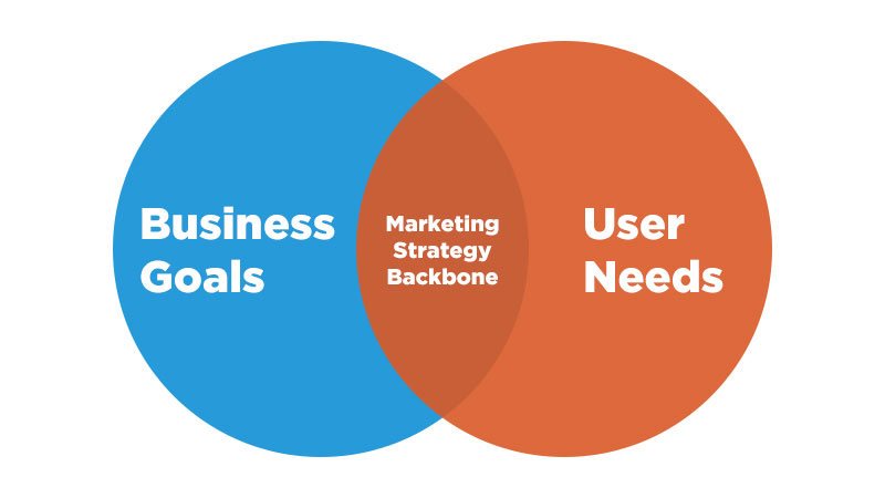
Marketing strategy backbone. Illustration by Tomas Laurinavicius.
2. Lack of strategy
This is what brands and inexperienced marketers do all the time, “let’s get likes and shares and it will be good”. No. There is a full cycle of sales funnel included: grabbing attention, increasing awareness, providing value, capturing lead information, interacting, providing even more value, gaining trust and loyalty and eventually selling. You need to have a defined strategy for every single step including user research, competitor analysis and market trends.
Fix: Know your end goal
Start out with defining clear business objectives and desired outcome. After that make sure you get to know the audience you are serving, their needs, and desires. Then see where these two worlds collide and the convergence will be your strategy backbone where you will base all your communication and visuals on.
3. Designing one format and using it across different mediums
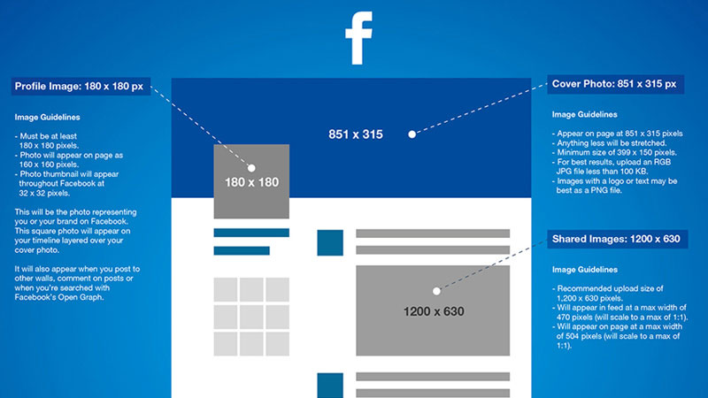
One size simply doesn’t fit all. Surprisingly social networks are not designed by some general guidelines that apply to everything. You need to study each social media platform to get familiar with different constraints when it comes to image formatting.
Designing once and distributing your visual content across various platforms will lead into the next mistake on this list – distorted, cropped incorrectly, and low quality image. Check out this guide to the most popular social network image sizes guide.
Fix: Have templates ready and re-use
Once you are familiar with platform constrains and formats, you can start creating simple templates,which can be easily re-used in the future rather than creating everything from scratch over and over again for each of these, and simply adapt your content to fit these templates.
4. Image is low quality and/or not appealing
Quality over quantity is probably used everywhere you go but it is true. For every visual content campaign make quality your top priority. People might not notice details you put into your work but they will definitely sense your effort and hard work which will lead to better engagement, more shares, and easier tribe building process.
Fix: Follow brand and social network guidelines
To establish certain quality standards, work with your designer on brand guidelines defining what fonts to use, colors, language, image types, spacing etc. Consistently keeping high quality will turn into more fans and followers who dig your style and can recognize you from a distance. Check out these guidelines by Heidi Cohen as a starting point for visual content marketing.
5. Don’t forget the context
Always think of the context how your content will be viewed including device, place, and even demographics. For example, Instagram is only a mobile based social network with over 300 million users. There is a way to show photos on desktop device but creating and consuming content mostly happens on mobile devices. Consider these constraints when planning your next visual content campaign.
Fix: Analyse where, how, and who will be seeing your content
If you are targeting teenagers make sure you don’t try to reach them in wrong places, like Facebook for example, where teenagers are quickly abandoning the platform. Think of where the cool kids hang out, Snapchat, Instagram and act upon these facts and challenges.
Burger King’s Biggest Virtual Burger On Instagram
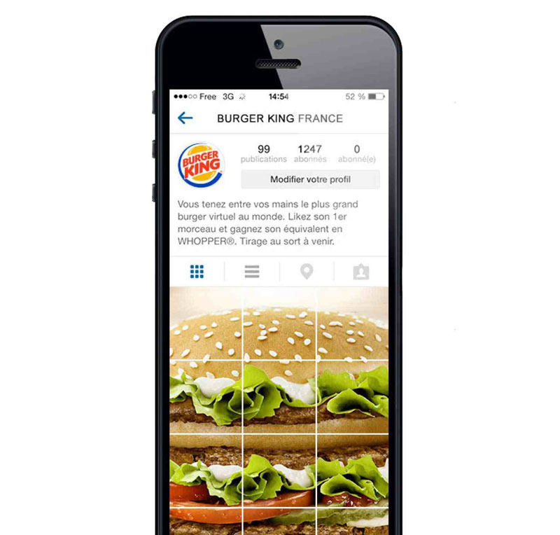
A great example is Burger King France‘s campaign of the biggest virtual burger on Instagram that was not only a brilliant idea in terms of environment and execution but also in brand awareness and engagement of certain age groups -in this case, teenagers, as they are the active ones on Instagram.
To celebrate the launch of their Instagram account, Burger King France created the world’s biggest virtual burger by posting over 90 pictures of burger parts which create the illusion of a giant Whopper. Brilliant!
This Ad Has a Secret Anti-Abuse Message That Only Kids Can See
Other great example of smart visual content implementation was done by a Spanish organization called the Aid to Children and Adolescents at Risk Foundation. In order to provide abused children with a safe way to reach out for help they have created an ad that displays a different message for adults and children at the same time. Play the video to find out how.
7. Leave your ego at home, you’re not designing for yourself
Just because you like it doesn’t mean it should be there. One of the most common mistakes we all tend to do when working for others is to judge everything by our personal taste. Get into the shoes of the brand viewer to better understand why, how, and what has to be designed to appeal to your campaign receiver. This gets especially hard when anyone in the team has no one close to the target audience to give a genuine point of view. This is when problems arise and people start fighting over their personal taste and preferences. Simple solution is to leave your ego at home.
Fix: Ask your audience
Simply ask your audience many questions to discover what they like, dislike, what and how they share content with their friends and try to pick out their brains if you get a chance to chat with them closely. Another trick is to analyse data, figure out what has been shared the most, what content is most shared by similar brands and your competitors, by the demographic you are targeting and act upon the data.
8. Lack of consistency
Brand loyalty is not shaped in a day or a week, it takes time for people to get to know your brand better, to better understand values and vision you stand for. Only consistent delivery of high-quality visual content and providing value will take you to the next level of customer relationship.
“It’s not what we do once in a while that shapes our lives. It’s what we do consistently.” ― Anthony Robbins
Another common mistake brands perform is inconsistency. Make sure to avoid different graphic styles, language and topics to stay relevant to your audience. Sometimes that means sacrificing some brilliant and potentially marketable ideas.
Fix: Stay consistent and identifiable
Neil Patel is a content marketing rockstar. Just because he has been working consistently on his personal brand for years and now creates highly anticipated content he gets his content shared bringing in new business opportunities. Neil has established a certain style of visually pleasing guides that lay his knowledge in an easy to digest way. A brilliant strategy to re-purpose your content and turn it into visual guides that are easily identifiable and highly shareable.

Nike’s mission statement is “To bring inspiration and innovation to every athlete in the world.”
9. Thinking short-term
Yes Christmas, Easter, New Year are great marketing opportunities but they don’t really create long-term brand value. You get engagement for these special occasions. Tons of views and shares just because it is relevant at a time but then suddenly your target audience freezes up and stops sharing your visual content is the worst you can do to hurt your brand. You should really get down to the roots of your business and, as in mistake 2 fix, get clear about your business goals, set clear values, mission and vision statements so you are getting closer to your ultimate goal rather than getting low hanging fruits.
Fix: Employ storytelling and long-term value creation
Perfect example of storytelling and long-term value creation in visual content is Nike. With their iconic “Just do it.” and “Find your greatness.” campaigns which keeps inspiring people despite the fact that it has been used a long time. These topics are still relevant whether it’s Christmas or Easter.
The legendary University of Oregon track and field coach, and Nike co-founder, Bill Bowerman said, “If you have a body, you are an athlete.”
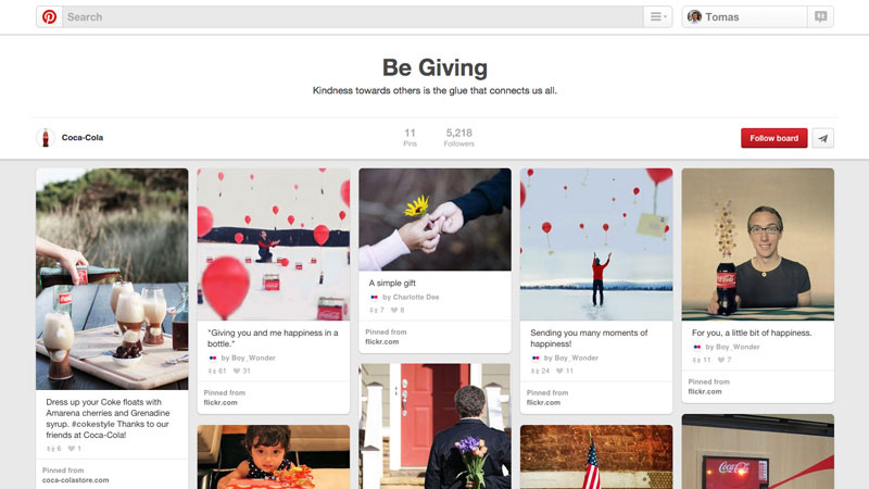
Coca-Cola curates a Pinterest board of fans generated content.
10. Ignoring user generated content
Internet in 2015 has empowered humanity to create more content than ever before. Brands ignoring their customers content are missing out on genuine and highly relatable visual content campaigns that directly talk to their fans in their own language.
Fix: Utilise fan generated content
It’s easier than ever to monitor your brand with tools like Google Alerts, SumAll, Mention and react to these mentions. Most important thing here is to put that support and love your customers show into creating more genuine and closer relationships. Once you start noticing and appreciating fan support people become evangelists of your brand that becomes the ultimate promotion tool.
Conclusion
Whether you have been wondering how to get started in visual content marketing or simply looking for ways to improve, this article will definitely help to level up your game. There are many ways to engage with the ever changing social media world and hopefully tips and tricks in this article will help you design better content, reach more people, and grow your business or personal brand.
Tomas Laurinavicius is a Lithuanian designer, entrepreneur, blogger & digital nomad. Founder of Despreneur and co-author of Mobile Design Book. Read the Original article
