Web design trends change rapidly. They come and go. Websites today follow very different trends than they did just a year ago. As web designers, it’s helpful to know what the current and upcoming trends are. It can help you stay ahead of the competition and it can help you meet your client’s needs. Keep in mind that “trend” doesn’t necessarily mean “new.”
Many new design trends come from the tastes and preferences of designers and users in design and usability. What makes those changes possible is improvements in technology. Technology is a major driving force and is always helping design move forward.
To help understand where we’re going, let’s take a look at where we’re been.
Where Web Design Trends Have Been
Web design for 2015 saw a lot of refinements of trends from 2014.
Recent years saw trends such as:
- Minimal
- Flat
- Video sliders
- Background video
- CSS animation
- Long scroll
- Hero images
- Hamburger menus
- Responsive
- Mobile first
- Newsletter popups
- Frontend frameworks
Many of these trends will continue to be refined. Some will be replaced with better alternatives. Others, such as background video, will be used with moderation.
Where Web Design Trends Are Heading
2016 web design trends could probably be summed up in two letters: U and X. Okay, and maybe one more word, too: mobile. Trends will follow best practices for both UX and mobile platforms. UX and mobile have been in view over the past few years, but now they’re front and center and the main driving focus of website design with an uncluttered UI.
This year will see even more refinement and standardization of current trends. We’ll see concepts go from just an ideal to the standard. From new to the norm.
Material Design

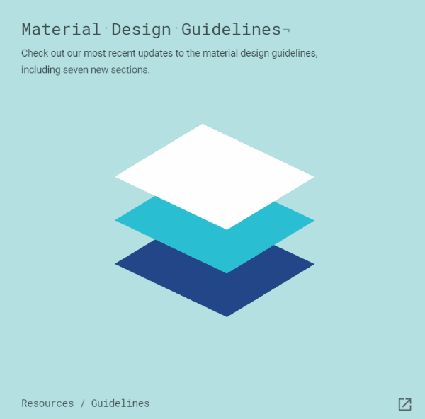
Material Design is an alternative to flat design that brings back some nice graphical elements. It’s a set of Google design standards that separates elements using the layers concept found in image editing software. It can stack and remove elements as needed. It even has built-in animations that would normally need to be created manually.
It’s a design language with a specific set of guidelines which takes out the guesswork. The results look the same from one platform to another. Since these standards are established by Google they’re sure to have widespread support.
It is possible, however, that adhering to strict guidelines will hamper creativity. I see this as a challenge to improve creativity within the guidelines.
Compared to Flat Design

Image by fet / shutterstock.com
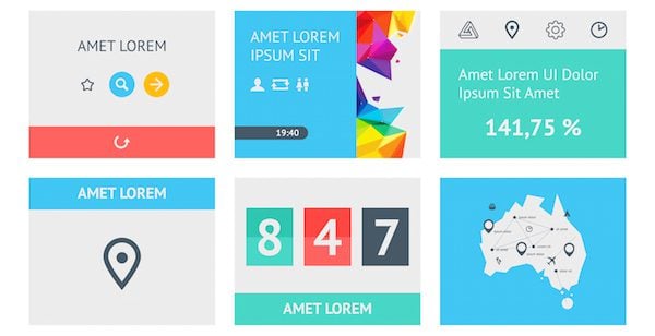
Material design is different from flat design. Flat design a design basis for presenting UI and graphical elements. It simply strips the visuals down to the basics and does away with visuals that try to mimic the real world with designs such as rounded corners, textures, shadows, etc. It minimizes all of the showy stuff that distracts from the story and reduces the amount of information that readers have to deal with. It has solid colors, sharp edges, and thin lines.
Flat design scales well and is easy to read on mobile devices. It’s practical and works well. It loads fast. The problem is appearance is secondary. It limits the amount of colors you can use and can sometimes look generic.
Flat design won’t be going away. It’s actually compatible with Material Design as well as being responsive and minimal. There will be a focus on turning off what’s not needed so they can focus on what is. The trend will be finding that perfect balance between the two. Flat doesn’t have to mean boring.
Material design is based in 3D. It’s a better choice for those who do want some stylish visual design. Material design gives you some of the design elements back. You’re not stuck with only having solid colors or not having animation.
Material design focuses on mobile devices first as more consumers are using smartphones and tablets as their primary devices, too. It streamlines the website and speeds it up. Expect material design to become the standard in web design.
by Randy Brown