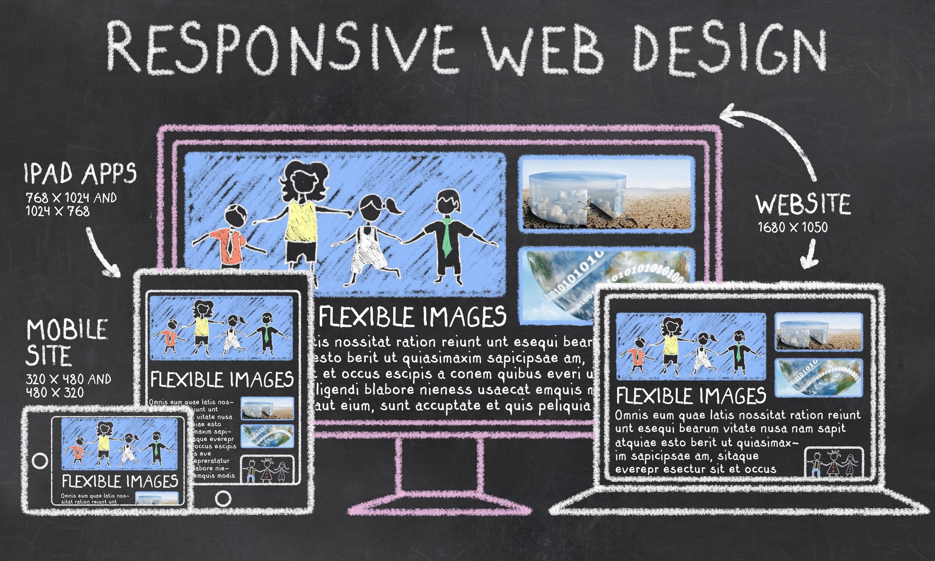
Have you ever pulled up a website on your phone and accidentally clicked the wrong link over and over because the text was so very tiny? That site wasn’t responsive. A well-designed responsive site takes fingertip size into account, making links large enough in a mobile view to click easily with your finger. Additionally, responsive design allows all site content to be viewed across all devices. Unlike once-trendy mobile versions of sites, a responsive site is not a trimmed-down version of your site—it simply morphs to fit any screen, from browser to tablet to phone, no matter the model or brand.
How to tell if you’re website is responsive
If you’re not sure if your site is responsive, pull it up on your desktop and then resize the window. Do menus and information condense and restructure themselves as the window shrinks? If not, you should consider a redesign!
Need some help?
If you think you may be interested in website design but have additional questions not mentioned above, our highly experienced team can help! We work to help clients achieve their Internet marketing and website development goals day in and day out, and it would be our pleasure to answer any questions you may have.
[yikes-mailchimp form=”6″ submit=”Get a Website Facelift Today”]
Please contact us today to learn more about website design with F22 Internet Solutions!