Web design trends change rapidly. They come and go. Websites today follow very different trends than they did just a year ago. As web designers, it’s helpful to know what the current and upcoming trends are. It can help you stay ahead of the competition and it can help you meet your client’s needs. Keep in mind that “trend” doesn’t necessarily mean “new.”
Many new design trends come from the tastes and preferences of designers and users in design and usability. What makes those changes possible is improvements in technology. Technology is a major driving force and is always helping design move forward.
Typography
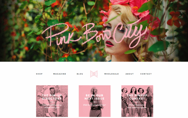
Image by http://www.pinkbowcity.com/
Increased resolutions and responsive designs make it possible to improve typography, which is why that is one of the web design trends we simply must include here. Typography can be more colorful and stand out. It can make a statement. Two trends that I’ve seen with typography are the use of serifs and hand-writing. Each have specific uses.
- Serifs help improve legibility. They were removed previously due to lower resolution screens and screen size. Screen resolutions and sizes are getting larger. Also, layout designs are cleaner and leave room for more elegant fonts. Expect to see serifs more often within the content itself.
- Handwriting is more personal. If it’s done correctly, it’s pretty and adds a special touch to a website. Just like serifs, the challenge is to keep the style legible and readable on small screens. Hand-writing will mostly be used in logos, headers, post titles, menus, business cards, and so forth.
One thing to consider is more users are consuming content on mobile devices. Unfortunately lower end devices, such as the Fire HD 10, display lower resolutions. This is more noticeable on larger screens because they have a lower pixel density due to having the same resolution as their smaller counterparts. One solution is to display typography based on the screen resolution. This means serifs and handwriting would display on mobile devices for high-res screens while screens with lower resolutions could receive a font that’s more suitable to its resolution. Of course server speeds and load time have to be taken into consideration.
Mobile UX
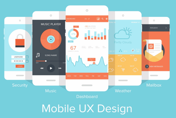
Image by vasabii / shutterstock.com
Not only will typography become more suitable to mobile screens and resolutions, but navigation, forms, images, and mobile-specific features (such as GPS) will have the focus of design. The use of images will change somewhat. Where images have been used for effects and text, CSS and fancy fonts will be used for effects and text will be used for text. This reduces page-loading times and server load.
Touch events are becoming more prominent. More sites are using plugins to handle events such as tap and swipe. This takes websites beyond just being responsive to the screen size, but also to the screen type, finger size, amount of pressure used, etc. Buttons and fields have to be large enough and have enough distance between them so they’re not hit accidently. Which brings us to mobile layouts.
Mobile Layouts
Minimalism rules for mobile devices. Some desktop elements can be hidden when the site is viewed on a mobile device. Other elements will be adjusted or modified depending on the screen size and type. This allows the message to fit the screen. Strip out the elements that are less important and fit it to the screen without losing the message.
Slideshows, images, buttons, elements, menus, and so forth should be developed with mobile in mind. Fortunately, Material Design brings back visual elements so sites don’t have to look plain on mobile. Also, you can render an image at a different size or resolution depending on the size of the screen. This will speed up the page-loading and the images will still look great on mobile devices.
More Imagery, Less Text
Divi Café Live Demo
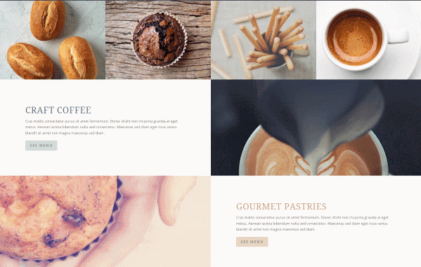
Consumers tend to look more at pictures and video and less at the text. This creates a balancing act between SEO and UX. Search engines prefer text they can index. This will move text-rich content to sub-pages and the image-rich content to the homepage. If text is required for the homepage, try to place it under the imagery. Target the users first and the search engines second.
Browsers are becoming faster at rendering images. This means images can be larger with higher resolutions than before. Expect a greater emphasis on higher quality images and artwork.
Tiles Replaced with Cards
Extra theme masonry blog module
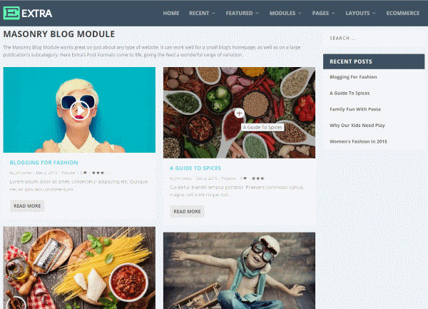
We saw lots of tile-based designs in 2015. Pinterest made (or helped make) the design popular. Cards take the design to a deeper level by adding functionality and interactivity. They can provide more information using hover effects, by flipping the cards over, expanding them, and more. They are a great design element that places the focus on imagery and offer a usable way and help make the content easy to see at a glance. They essentially create grid layouts while minimizing content.
Dynamic Storytelling
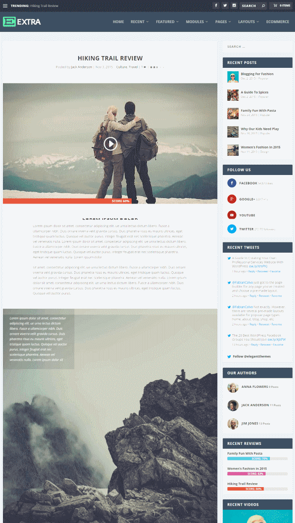
Dynamic storytelling works by telling a story through graphics with textual support. This is one of the web design trends that has held popularity for a few years now. It guides the visitors through a thought process or a timeline. It can show benefits of a product or service, history of an organization, or anything you want your visitors to know about you or your company. This can be a video or presentation that’s automated or one they can step through themselves by clicking or scrolling.
This requires a high level of graphic skill and has to be done carefully and skillfully in order to look right. It requires storyboarding, knowing your website’s message, and how to convey that message. It should highlight benefits and features in the most succinct way possible with the right balance between graphics and text. Too much of either can result in a UX that’s unfocused, overwhelming, or both.
Greater Focus on Social Comments
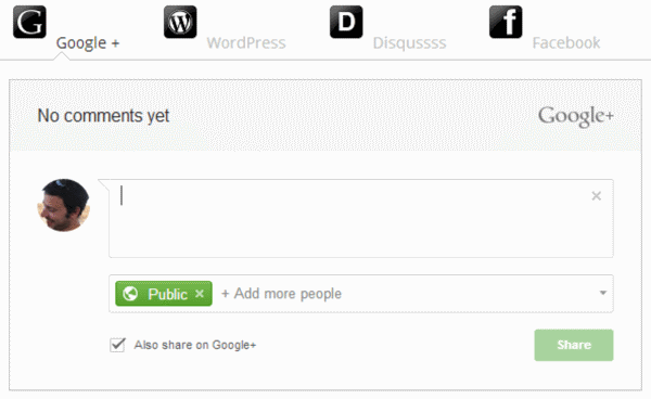
Image by Social Comments / https://wordpress.org/plugins/social-comments/screenshots/
WordPress has a great commenting system, but more readers tend to leave comments within social networks than on websites themselves. To capture social comments, the trend continues to move toward more websites using social commenting systems rather than the built-in WordPress commenting system. This ensures visitors can comment using their social accounts and/or any social media mentions are picked up and displayed right on your site.
Greater Focus on Content, Less Focus on Ads
Over the past few years, readers have become blind to ads within sidebars. Homepages have moved from being a banner for the content and ads, to being an eye-catching landing page with great visuals. They contain more visuals than text and the ads have moved to the content itself. This requires a great layout to make room for them, which leads us to…
Greater Focus on Article Layouts
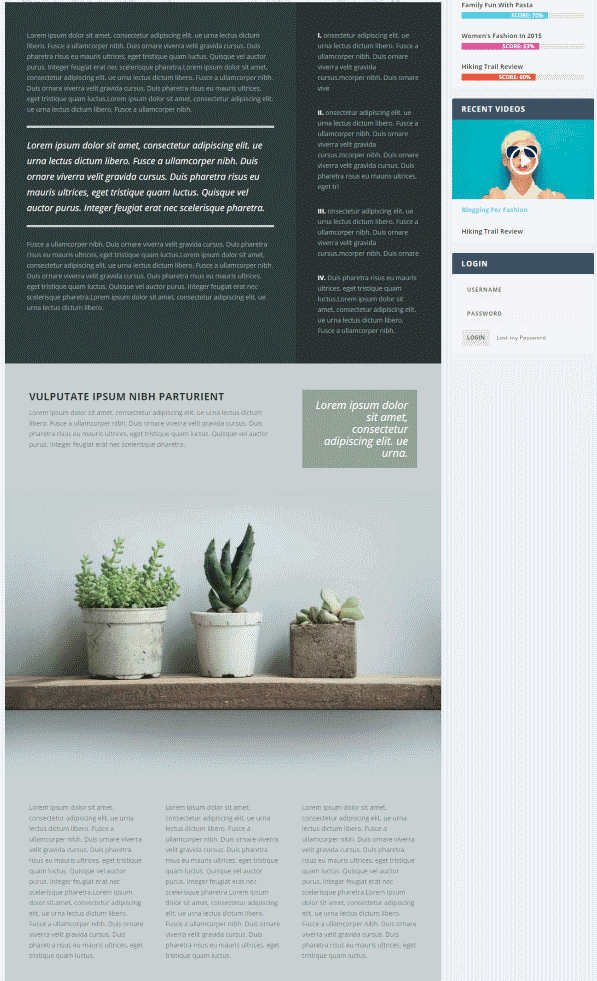
Divi Café Life Demo
We’ve seen drag and drop builder plugins that let us create homepages, but there is also a need for layout design within the posts themselves. Systems that allow for post layout design will be popular as users can create layouts with widget areas and place modules, giving their sites a much more elegant look and feel.
Designer Tools
There are some interesting tools to help designers to prototype websites and design layouts that have landed on the scene recent or are projected to be released this year. Here are a few that I expect to be popular in 2016.
Adobe Project Comet
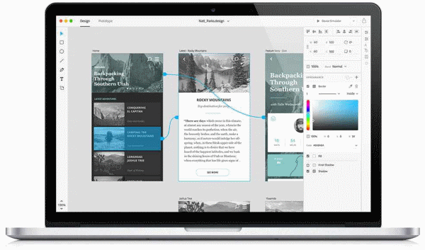
Adobe Project Comet arrives this year. It’s a cross-platform app for designing the UX from start to finish. It has tools for wireframing, visual design, interaction design, prototyping, and more. You can preview it on any device. It works with Photoshop and Illustrator, and can be expanded through community-built plugins. This will be the developer tool to watch.
Sketch
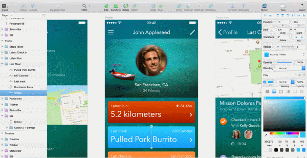
Sketch is an app for Mac that many are using in place of Photoshop. It has a nice work environment and was designed specifically for web and mobile designers. It has features such as layer styles, text effects, tools to create vector elements, and more.
Final Thoughts
These are just a few of the web design trends that will become more prominent throughout 2016. Of course the popular trend is not always the best choice, but they are good tools to have waiting in the wings should you need them. Plus, this process of finding ways to stand out from the crowd can help push a trend forward.
Your turn. Do you agree with these trends? What web design trends have you noticed that I left out? Do you have anything to add? Let us know in the comments below.
Article thumbnail image by Graphicworld / shutterstock.com